How to design a graphic concrete surface texture pattern
BY LINDA HIRVONEN
15.12.2022
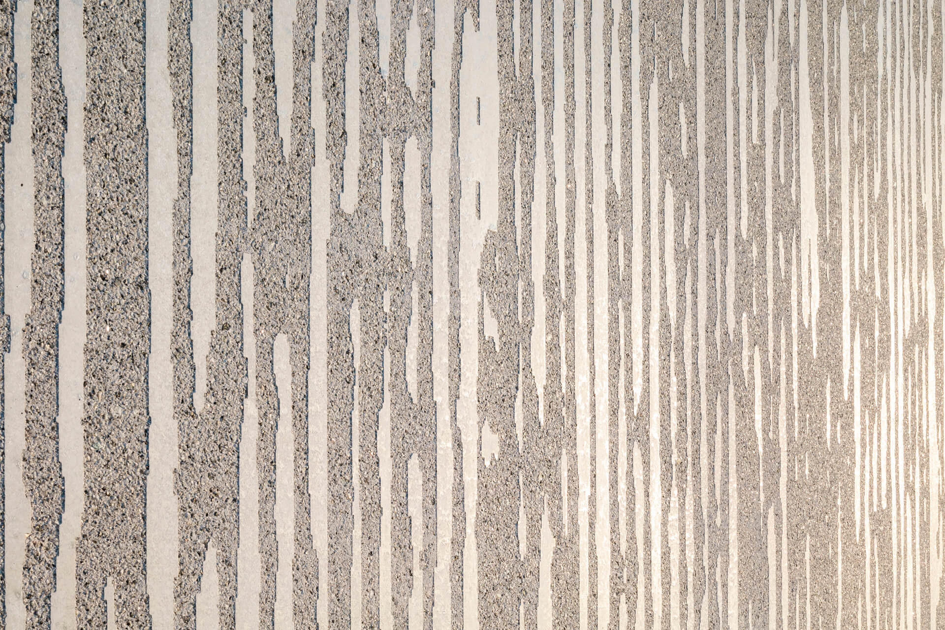
Designing a Grahic Concrete pattern is relatively simple – use only one color and let your imagination run free. Figurative patterns work well with graphic concrete, but if you just wish to leave an expression of a surface, then you should think about the pattern as texture surface. Of course there is a fine line between a patterned and a texture surface. With graphic concrete you basically get both. The look and the feel.
A well-functioning graphic concrete pattern however requires some knowledge regarding repetition, contrast and the design attributes specific to the graphic concrete technology. Please read on to get to know the key issues.
Start with a blank square.
Obviously you start with the architecture and aesthetics. But once you get to the pattern design, you need to know a few factors. The image and the size can be any, but when designing a graphic concrete texture pattern your best canvas is a square of 3200x3200mm. The size is enough to create an illusion of a surface and also your guide to also ensure cost efficiency.
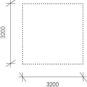
The most cost efficient size for a pattern is maximum 3200x3200mm.
Use only black and white in the pattern
Remember that the final graphic concrete surface comes two surfaces – the contrast between the smooth form finish and exposed aggregate surface. This means that in graphic concrete pattern there can be only black and white, literally. There are no grey areas in the pattern, other than what the eye forms.
The pattern vs the end result - concrete surface:
-
White = smooth form finish
the areas illustrate the fair face surface aka the smooth cement surface in the end result in concrete -
Black = aggregates will be exposed
black areas illustrate the exposed surface aka the more rough surface where the stones are visible in the end result in concrete
There are multiple ways of achieving the wished outcome. One way is making an pattern as an image and the alternating it into a halftone image (1-bit bitmap image). If you are working with vectors, please choose the color as CMYK and the color as 100% Key color.
For more info you may download our design instructions.
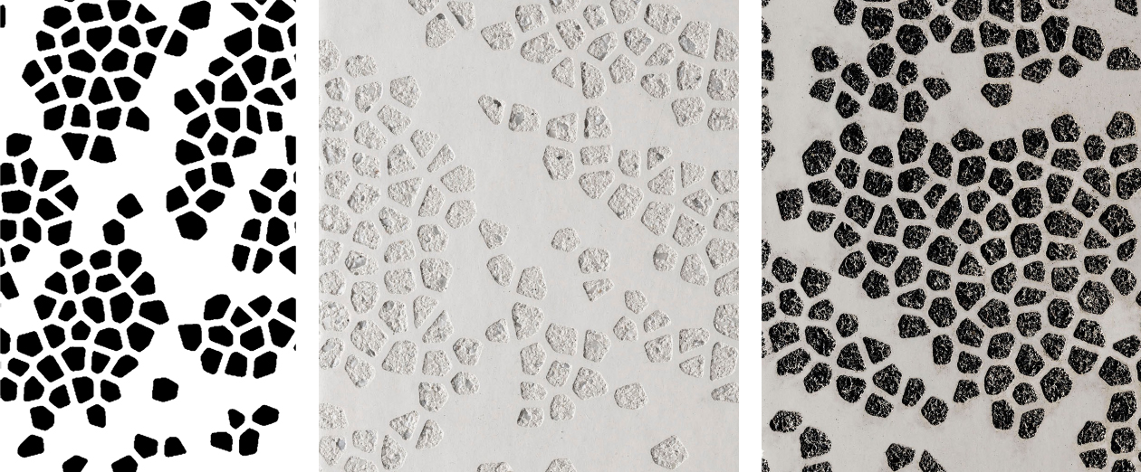
The pattern file is always black and white, but the end result is determined by the concrete color (cement + aggregates).
Photos from left: 1) the pattern file, 2) white cement + white aggregates, 3) white cement + black aggregates
Minimum size of color areas
Another key issue is to remember that the end result is concrete and the actual scale of the façade or structure. Therefore, to ensure that the pattern actually translates on to the concrete surface and to achieve the wished visual outcome, the minimum area of either color should be 5mm (0.2 inches).
From experience I may say that the appearance of images and patterns are quite different on the computer screen than in concrete. There will be a temptation to make very small details and fine lines. But trust me, on concrete bigger is usually better.

Photo: Remember to also leave enough space between the different color areas. 5mm/0.2 inches are recommended because of
concrete as a material and scale of construction.
Make a seamless pattern
You can draw inspiration from all over as with any design process. The key is to make a seamless repeating pattern that is continuous to all directions. In case you are new to pattern design, one way of achieving a seamless pattern can be found in here: The Trick - How to make a tile-able pattern.
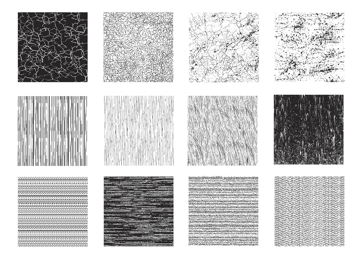
Photo: Surface pattern study
Consider the viewing distance
When you've got your pattern sorted out, it's good to know how it will be layed out on the facade. Consider how you want the image to appear in the environment. A good design is one that can be viewed from afar while revealing more detail the closer you get. Read more about viewing distance in a story: Pattern, scale, and viewing distance of Graphic Concrete
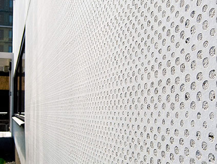
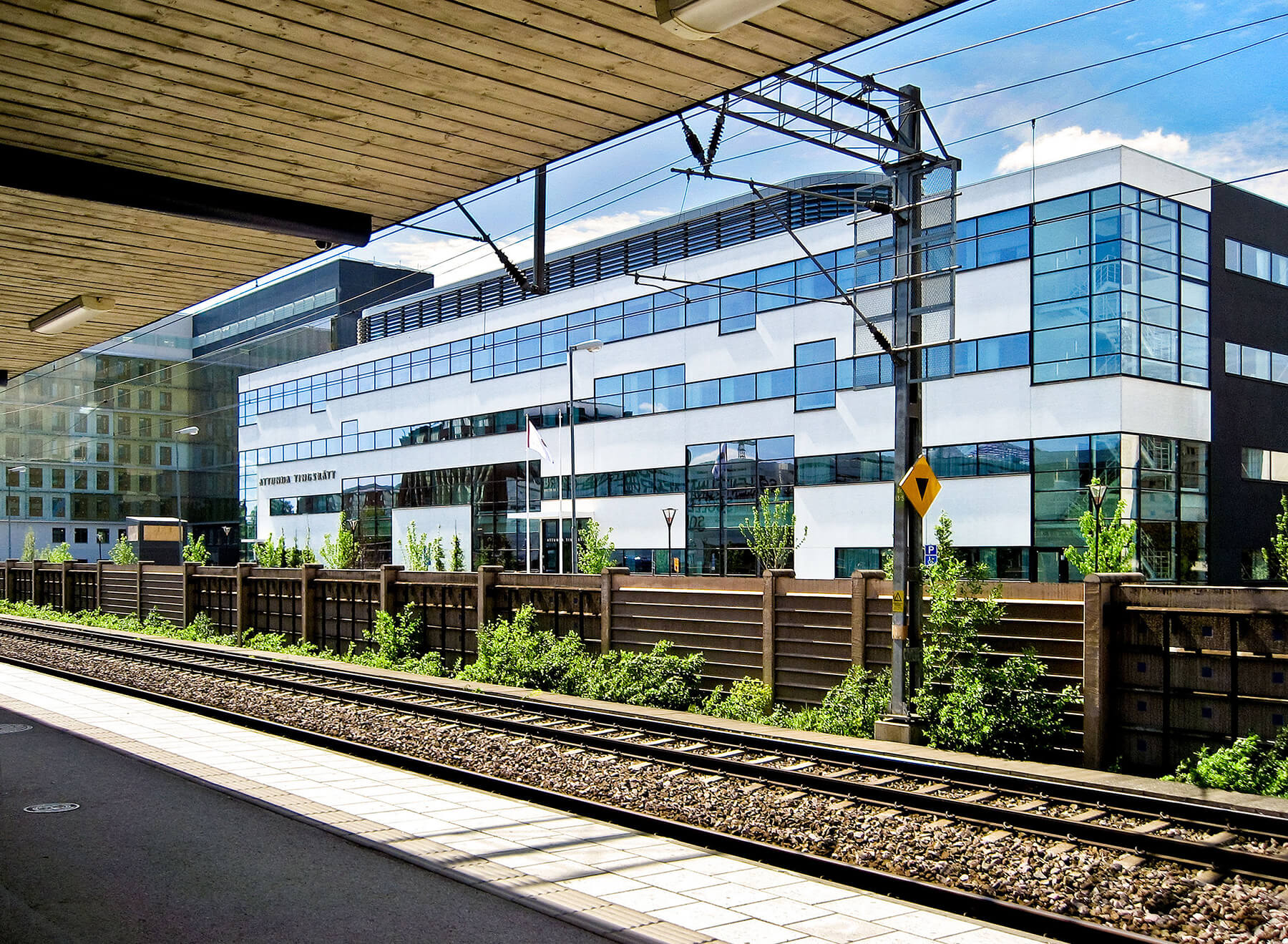
Photo: Attunda Tingsrätt, Sweden
From a far the façade appears to be white. When the surface is not completely even, the façade could appear
cleaner for longer as all impurities will gather in the small raster circles.
Choose color and contrast
Colors and contrasts play an important role in bringing out the details: changing the aggregate and/or cement color offers a vast amount of variation in the overall effect. Read more about the color options in these stories Your Own Special Cocktail: When it comes to concrete and color and Call for color - 4 ways to get colors to concrete.
Keep in mind also the panel sizes
Optimizing the design for the technology ensures cost efficiency. When you are designing a pattern for a building façade or concrete structure such you need to also take into consideration the panel sizes and the technical attributes of graphic concrete technology.
If possible, the panels maximum width or height would be maximum of 3200mm. This is not required, but recommended for also easy use of the method in precast concrete production. You can read more about a precast facade in a story: The Top 4 Considerations when you Design a Precast Facade.


And you are done.
And remember, we are just one email or phone call away, in case you need any help with the process or technical advice. It is worthwhile contacting us in the early stages of the project, so we can ensure the best possible outcome and cost-effective result for your design.
Please contact your local representative for more info.